

20 ホームページ中級講座 HTML編 フォトギャラリーを作る


今回はよく使うフォトギャラリーを作っていきましょう〜写真とキャプションの組み合わせのカード形のデザインです。<figure>という要素を使います

<figure>?フィギュアって読むんですか?あの人形の?
読み方はあってますね。figureは図という英語です。図とキャプションという組み合わせですが、htmlでは写真とキャプションの組み合わせも使っています。
目次
完成イメージ
下図のようなフォトギャラリーを作成してみましょう。h1のタイトル要素にはgoogle fontsのoswaldを適用しています。ギャラリーとなる場所は、figure要素を使います。写真は、Photoshopなどで円に加工するのではなく、長方形の状態で用意し、cssを使って円表示にします。
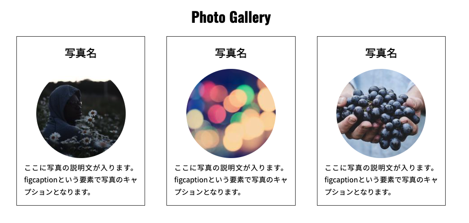
Photo GalleryのHTMLをコード模写しよう
Photo_Gallery というフォルダを作成し、そのフォルダ内にindex.htmlとstyle.cssのファイルを作成しておきましょう。
<!DOCTYPE html>
<html lang="en">
<head>
    <meta charset="UTF-8">
    <title>column</title>
    <link rel="stylesheet" href="style.css">
    <!-- google font -->
    <link rel="preconnect" href="https://fonts.googleapis.com">
    <link rel="preconnect" href="https://fonts.gstatic.com" crossorigin>
    <!-- oswald -->
    <link href="https://fonts.googleapis.com/css2?family=Oswald:wght@500&display=swap" rel="stylesheet">
    <!-- 日本語NotoSansJP -->
    <link href="https://fonts.googleapis.com/css2?family=Noto+Sans+JP&display=swap" rel="stylesheet">
    <!-- /google font -->
</head>
<body>
    <div class="container">
        <header>
            <h1 class="title">Photo Gallery</h1>
        </header>
        <div class="flex">
            <section class="box">
                <h1>写真名</h1>
                <figure>
                    <a href="#"><img src="https://picsum.photos/200/200?random=1"></a>
                    <figcaption>
                        ここに写真の説明文が入ります。figcaptionという要素で写真のキャプションとなります。</figcaption>
                </figure>
            </section>
            <section class="box">
                <h1>写真名</h1>
                <figure>
                    <a href="#"><img src="https://picsum.photos/200/200?random=2"></a>
                    <figcaption>
                        ここに写真の説明文が入ります。figcaptionという要素で写真のキャプションとなります。</figcaption>
                </figure>
            </section>
            <section class="box">
                <h1>写真名</h1>
                <figure>
                    <a href="#"><img src="https://picsum.photos/200/200?random=3"></a>
                    <figcaption>
                        ここに写真の説明文が入ります。figcaptionという要素で写真のキャプションとなります。</figcaption>
                </figure>
            </section>
        </div>
    </div>
</body>
</html>
<div class=”flex”>〜</div>内にsection要素を指定します。section要素にはclass名boxを指定しています。
画像はキャプションを伴う場合、figure要素を使います。figureは図という意味をもち、グラフと説明文などに使われていましたが、画像とキャプション(figcaption要素)を使ってのマークアップに使用されます。
動画で学ぶWebデザイン教室 Fuku…
HTML要素 -よく使うタグ名と使う場所とコード確認- | 動画で学ぶWebデザイン教室 Fukuokamiyako
HTML ブロック要素 代表的なよく使うブロック要素 HTML インライン要素 用途が高く意味合いがあるインライン要素 (Document Type De
画像であるimg要素には、ランダムに画像を使用できる「Lorem Picsum」さんの画像リンクを使っています。
またhead要素内でgoogle font の日本語書体「NotoSansJP」を入れています。
Google Fonts

Noto Sans Japanese – Google Fonts
Noto is a global font collection for writing in all modern and ancient languages. Noto Sans JP is an unmodulated (“sans serif”) design for the Japanese language
HTMLのマークアップファイルが完成したら、style.cssファイルを同じフォルダに作成しておきましょう。
CSSコード模写 フォトギャラリーの動画2
次はCSSの作成です。下記の動画を参照してからCSSのコード模写を行いましょう。
親要素の<div class=”flex”>でdisplay:flex
.flex {
/* 子要素を横に並べる / display: flex; / 中の子要素の幅で親要素の幅に均等に余白を入れ広げる */
justify-content: space-between;
margin-bottom: 2em;
}
上記のコードの場合、子要素であるsection要素が増えた場合、横に詰め込むような形になります。
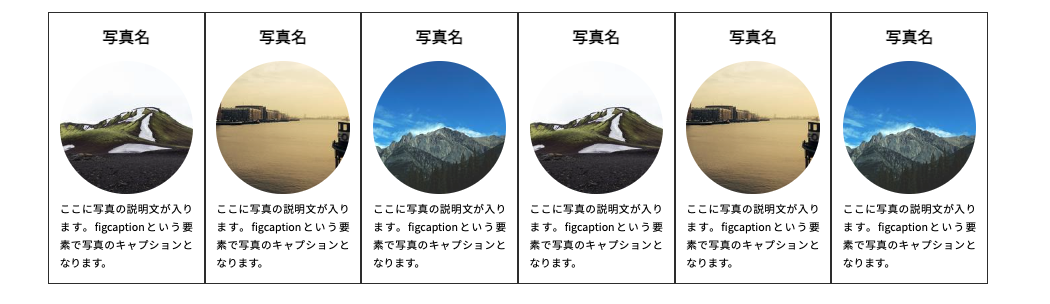
flex-wrapを追加
display:flexを適用する際にその要素にwidth(幅)が指定されている場合、その中で収めよう・・・としてしまうため、中の子要素の幅で行変えを行いたい場合があります。その場合はflex-wrap:wrapを追加します。
また、1行目・2行目の縦の余白を開けるためにrow-gapも追加します。
.flex {
/* 子要素を横に並べる / display: flex; / 中の子要素の幅で親要素の幅に均等に余白を入れ広げる */
justify-content: space-between;
margin-bottom: 2em;
flex-wrap: wrap;
row-gap: 2em;
}

section要素のclass=boxでの指定
.box {
width: 30%;
text-align: center;
background-color: #fff;
border: 1px solid #333;
padding: 1em;
box-sizing: border-box;
}
上記のようにwidth:30%で子要素の幅を指定しても大丈夫ですが、flexboxには、flex-basicというプロパティもあります。同時に指定した場合、flex-basic側が優先されますので注意しましょう。
MDN Web Docs

flex-basis – CSS: カスケーディングスタイルシート | MDN
flex-basis は CSS のプロパティで、フレックスアイテムの主要部分の初期の寸法を設定します。 box-sizing で設定していない限り、このプロパティはコンテンツボックスの寸…
CSS模写コード
@charset utf-8;
*{
margin:0;
}
aricle,section,
figure,figcaption{
display: block;
}
body{
font-size:1em;
line-height: 1.7;
font-family: 'Noto Sans JP', sans-serif;
}
.container {
width:960px;
margin:0 auto;
}
.title {
text-align: center;
padding:.5em 0 ;
font-family: 'Oswald', sans-serif;
font-size:2em;
}
.flex{
display: flex;
justify-content: space-between;
margin-bottom: 2em;
}
section.box{
width:30%;
text-align: center;
background-color: #fff;
border:1px solid #333;
padding:1em;
box-sizing: border-box;
}
section.box h1{
margin-bottom: 1rem;
}
section.box figure a{
transition: 2s;
}
section.box figure a:hover{
opacity: 0.5;
}
section.box figure img{
border-radius: 50%;
}
section.box figcaption{
text-align: left;
text-align: justify;
}

フォトギャラリーのHTML/CSSコードは上記になりますね。
作成方法と合わせて見栄えを動画で確認しましょう
HTMLコード模写 フォトギャラリーの動画
まずは動画に目を通してもらってから、下記のコード模写を行います。